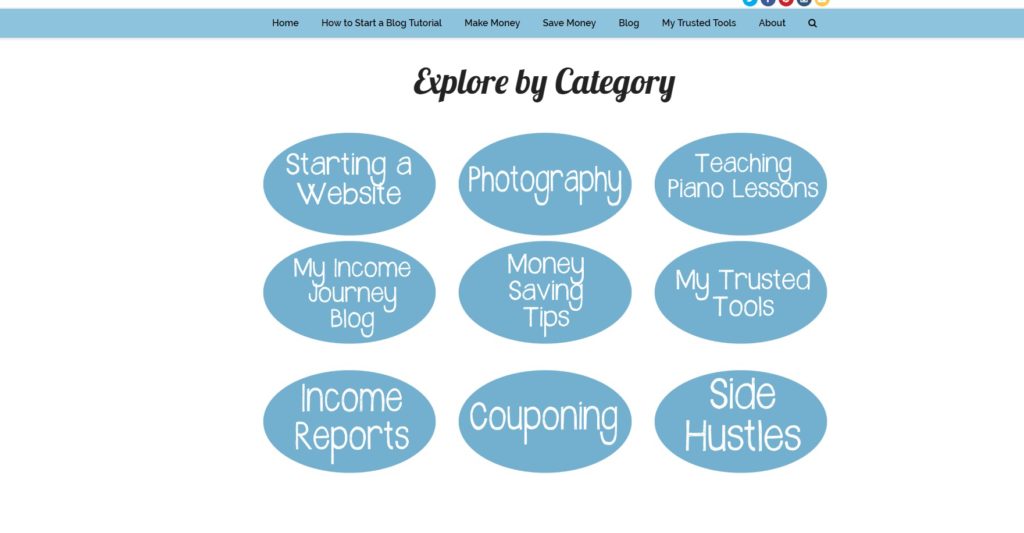
Hi Everyone! In case you haven’t noticed, My Income Journey is now sporting a new more sleek look! I’ve been working hard getting all my photos updated, new links made, and even added a few sections to the site. I now have my homepage divided into three sections “Make Money”, “Save Money”, and “Spare Change”. The new graphics are easier to read and hopefully more appealing to look at. Here’s a bit of what the old homepage looked like.
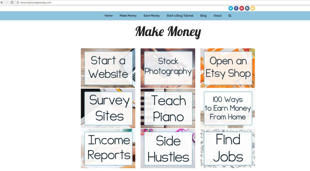
And here’s part of the new.
So much better, right? In addition to changing the way the homepage is organized and changing the graphics, I’ve added two new sections to “Save Money” that are about Investing/Trading and Travel Savings. Detailed articles will be coming on those topics soon!
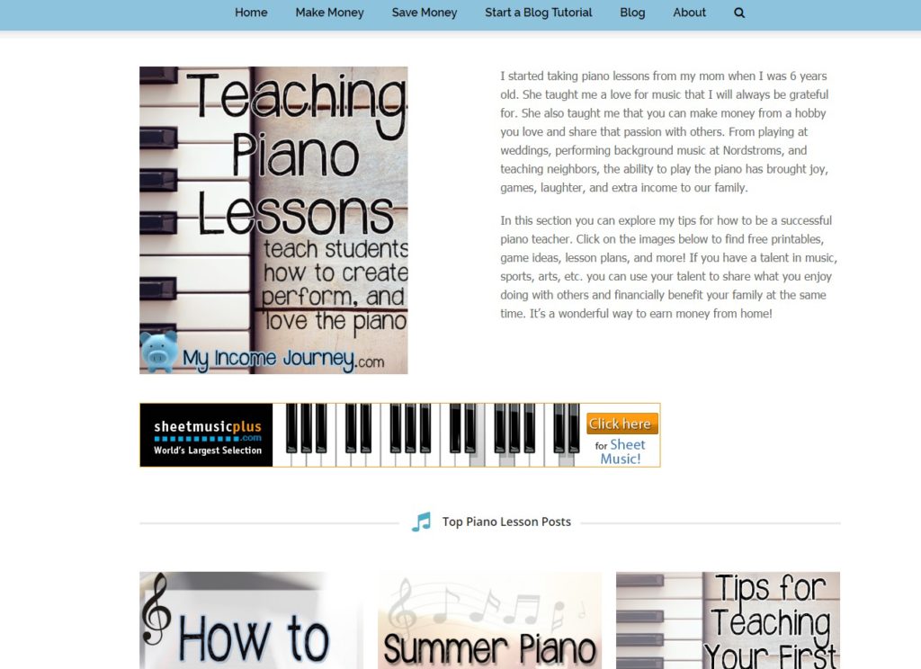
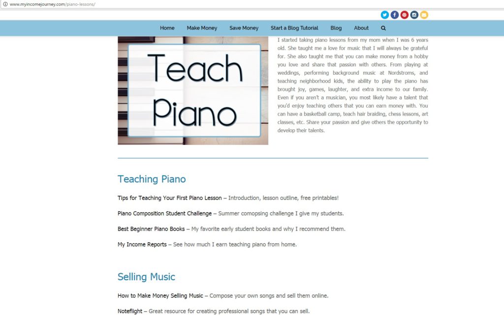
It isn’t just the homepage that has been revamped, my landing pages for each section have had a much-needed update. Take my “Teach Piano” section for example. It used to look like this when you’d click on it. I didn’t get a good screen shot before updating, but basically it was all image based and I used my Pinterest images to link to each article. It was very busy and not organized.
I’ve decided to not use images, but rather text links to help you find the articles you’re looking for. The text links are much easier to organize, give the site a cleaner look, and I think are more user-friendly.
I hope this new layout gives you a better experience at My Income Journey and makes it easier for you to find the articles and tips you’re looking for. I wish there was some way to just get things right the first time, but that’s never the case. If you still haven’t started your own blog yet, click here and I’ll help you get started.


